I found a wonderful site, Colour Lovers, that allows you to use Hex code to create a pretty much infinite array of color combination. You can also source your palettes from photos or just about any image on the net, so if you really want the color of that flower in the photo, or the exact tone of the bay of that tropical island, it will match the tones more or less perfectly.
I had been playing with things, and not taking anything too terribly seriously, but now I am in the process of trying to make mock ups of invitations. Which means that I have to make a decision!!
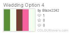
Luke and I originally decided on the green, with pink and brown (and white/ivory of course) accents, for the simple reason that pink flowers are abundant and easy to find. But my dad, who is a very fashionable, artistic man with an eye for color, suggested we consider maroon or burgundy. So of course I went back to Colour Lovers and made yet another palette. So without further ado, here are a few of the things I've been looking at. Any opinions? Mix and match?

Color by COLOURlovers
This palette is based on the colors from David's Bridal's bridesmaids dresses.
Color by COLOURlovers
This is a little more intense with the pigment

Color by COLOURlovers
My first go using Maroon instead of pink. Though whoever 'created' this maroon called it tropical fuchsia.

Color by COLOURlovers
A second try, more of a Burgundy perhaps?
Which do you think looks best for a July wedding, amongst fir trees?
Coming soon, invitations and location news!
I like the DB palette the most. The colors are the most smooth there. While I like the other color sets, the maroons and greens in the other selections seems a bit overbearing. I like the lightness in the first selection is really nice, especially in a forest setting, where things will already be relatively dark.
ReplyDeleteThanks for the input. I liked those more originally too, but I'm thinking if the Burgundy is just an accent, it might not be too overbearing.
ReplyDelete